Titan Email - Dark Theme & Design System
Background
We see dark user interfaces (UIs) all around us, from mobile devices to huge televisions. However, designing for dark UIs is not as easy as it may seem. We cannot simply repurpose or reverse colour shades. If we were to do that, we’d risk damaging our information hierarchy as well as increasing eyestrain.
In 2021, the Titan design team was tasked with implementing dark theme for Titan - desktop, iOS and android. I led the work for the desktop app from research and ideation to design and launch.
Objective
The primary aim of this project was: To give users more control over ‘how’ they used our product; To make Titan more accessible; To increase user retention.
The dark theme was the #2 most requested feature on our feature request board. It has a cult following, and several good reasons are behind it. Not only does it boost battery life, but it also offers some health benefits. Prolonged exposure to blue light at night has the ability to trick our bodies into believing it’s daytime, which affects the natural circadian rhythm and hinders the ability to get a good night’s rest. Darker colours, however, can help remedy this issue by regulating the melatonin production in our bodies and supporting a healthy sleep cycle.
Approach
To begin, I needed to examine the identity of our product. Why do people use Titan? As Titan is a product that users depend on to communicate critical business information, it was vital to maintain the functionality of the platform and all its features.
Throughout the Dark Mode design process, preservation of the way people accessed and used all features was the main priority. Titan is spread across different platforms, so it was also important that we were providing a consistent experience across all apps and devices.
My Role
Lead and solo product designer for desktop app - Dark Design system (style guide, components library).
Timeline
I started with the initial proposals in Jun ‘21, and within 4 months, it was designed, developed and launched towards the end of September.
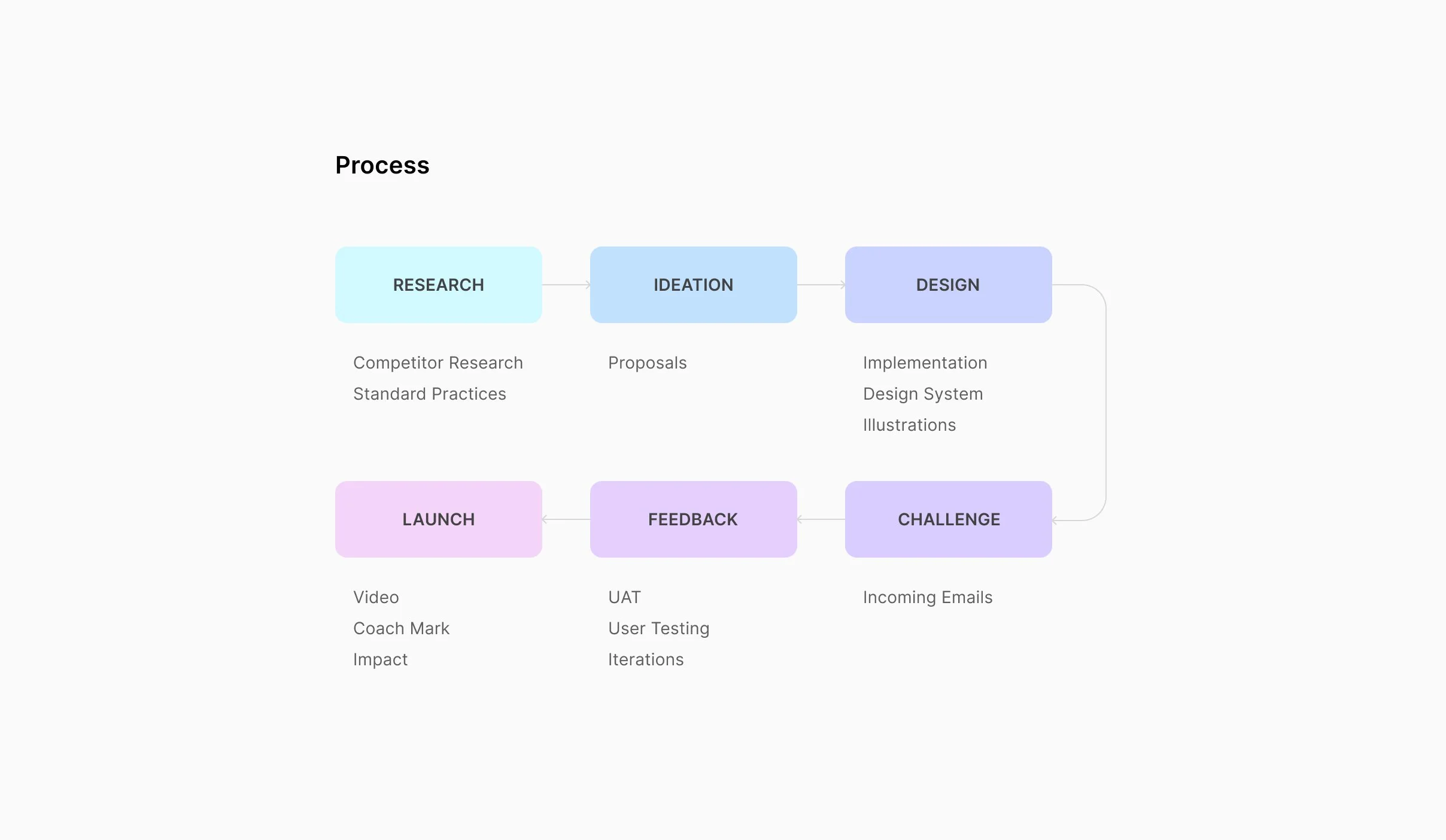
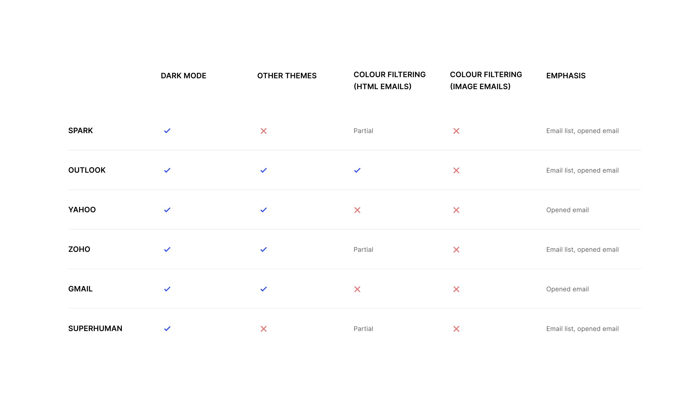
RESEARCH
Competitor Research
Dark theme has been around for quite some time. It has become the staple for every app, which explains why all of Titan’s competitors offer some version of it. As a part of my market research, I carefully examined all the product offerings of our competitors - their strengths and weaknesses.
Here are some of the insights from that research :
RESEARCH
Standard Practices
Before turning to the “dark side,” we did some digging around on the Internet to find any existing documents on standards and best practices. Here are some of the key guidelines that I used as a framework to design dark theme for Titan :
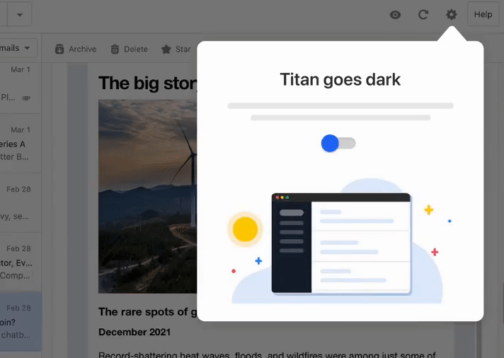
Creating choices
Users always prefer to be in control of their fate. There are advantages and disadvantages to implementing both Light and Dark Mode. The best solution for accessibility is to have a toggle button that allows users to switch between the two modes.
Grey over pure black
Using subtle shades of grey over pure black can help counter the halation effect caused by astigmatism, a condition that affects more than 50% of the population. It's also a lot easier to create depth in your designs when you are working with shades of grey.
Accessible contrast ratios
Using pure white(#ffffff) and pure black(#000000) together is a recipe for an accessibility disaster. Together they can render your UI illegible and ineffective. The text and background color combinations should always have a contrast ratio of 4.5:1, except in cases where the text is large—then it can be at least 3:1.
Details
The smallest details can help bring your design to the next level. Icons and illustrations, for instance, need to maintain their form while being cohesive with the new theme. For illustrations, this means the tiniest color details need to be revised appropriately to support the dark environment.
IDEATION
Proposals
From the beginning, I understood how cautious my approach needed to be for developing the dark UI color palette. I was focused on prioritizing accessibility, usability, and functionality.
To reserve most of the space for dark greys, I reduced the usage of accent colors while designing color schemes, one accent color and a few dark grey shades. This helped me create color schemes with the required complementary contrast. To make the design accessible, I made sure every text and background color combination passed the WCAG’s AA contrast standard.
I came up with the following proposals in the early design phase:
1 Graphite colors with emphasis on the email card list
3 Carbon colors with vibrant highlights
2 Graphite colors with emphasis on the menu sidebar
4 Plum colors with vibrant highlights
DESIGN
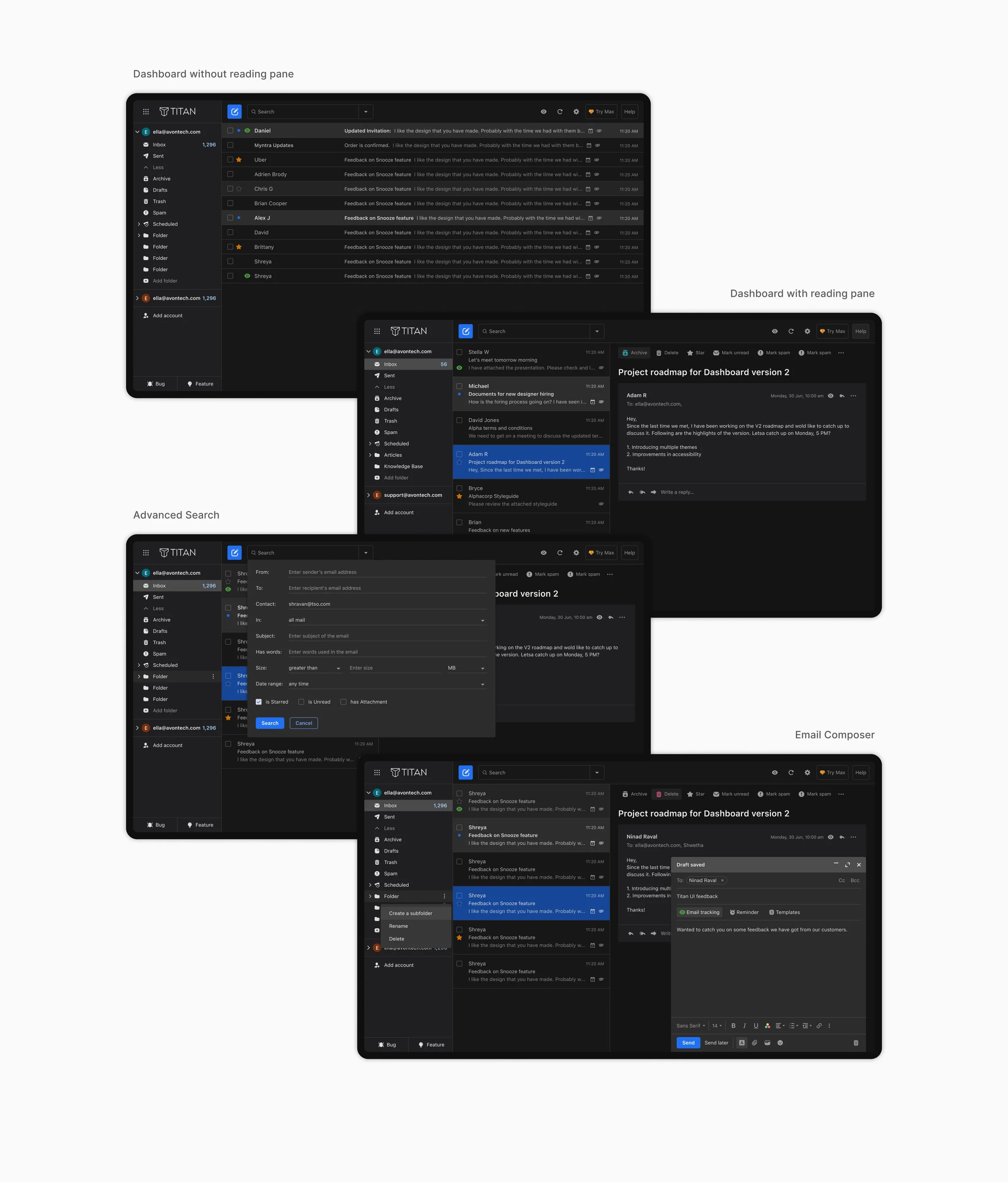
Dark Theme Implementation
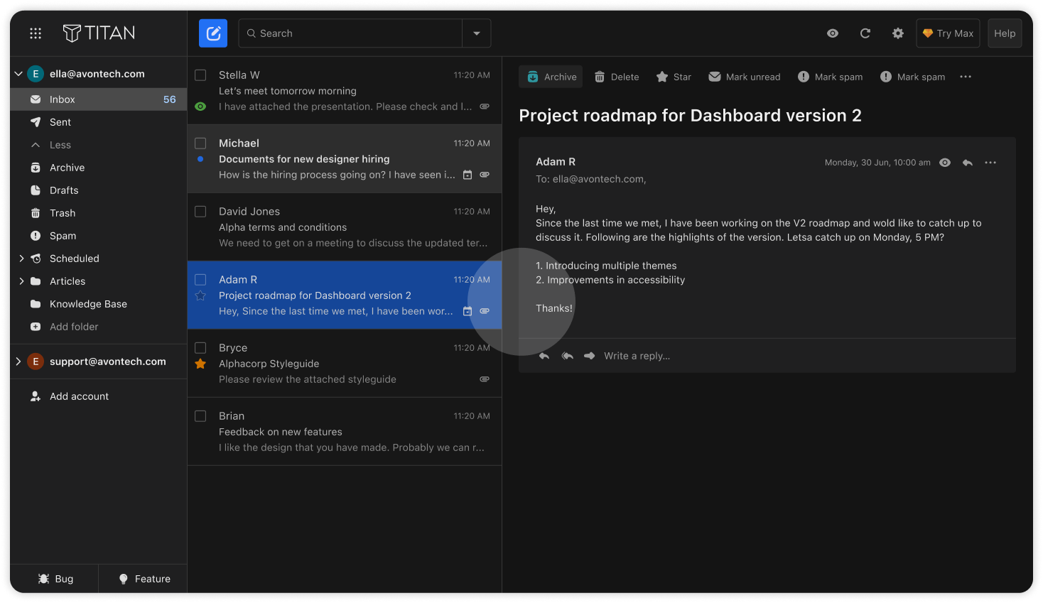
Out of the four proposals, the second option, where the primary emphasis was placed on the menu sidebar, was selected. This approach stood out because it delivered a more consistent and cohesive experience across both themes. Once the direction was finalized, we developed a dark theme palette and style-guide and implemented it consistently across the entire email interface.
DESIGN
Design System
The biggest challenge I faced while designing the Dark Mode was making sure it aligned with the existing Light Mode style guide and component library.
To address this, I first started with two versions of all the components—one for the Light Mode and one for the Dark Mode. I soon realized how time-consuming and unnecessarily complex it was as I found myself drifting away from the logic of the color scheme.
To develop an easier and scalable solution, I mapped each color of the Light Mode to its corresponding counterpart for the Dark Mode. Moreover, to make it even more convenient for choosing colors in Figma, I named colors by how they were used, and not by how they looked. I then split the colors for the two themes into two color libraries. This allowed me to simplify the process of changing the theme in Figma.
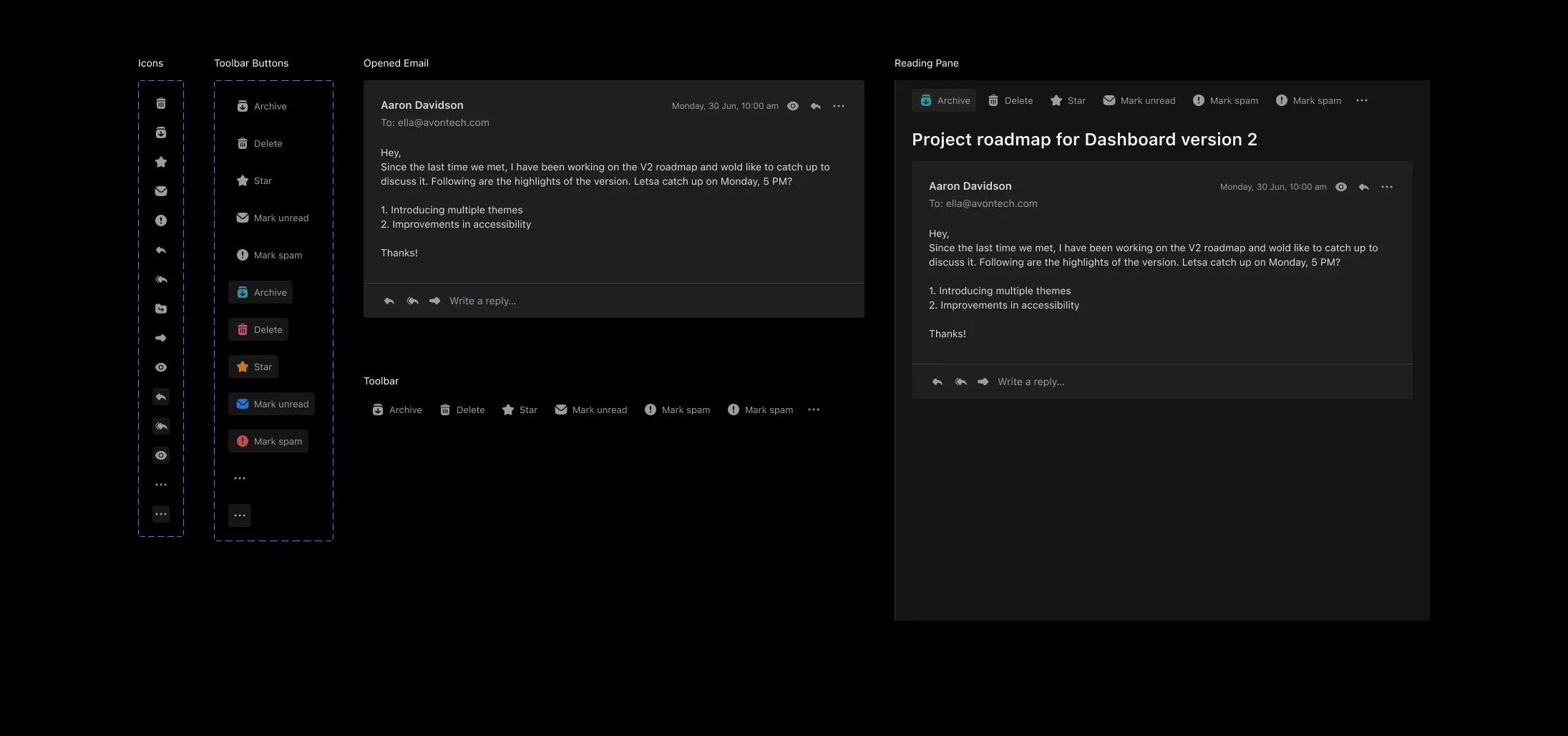
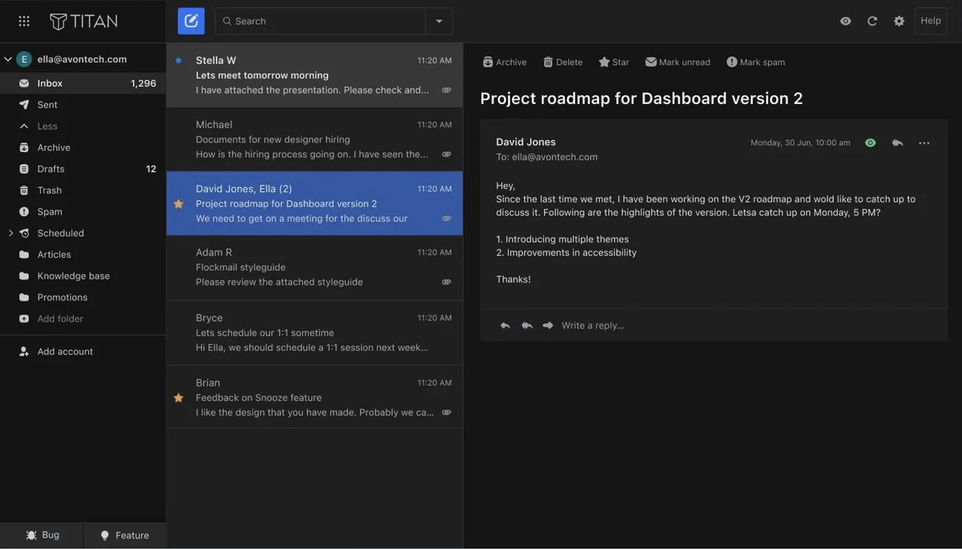
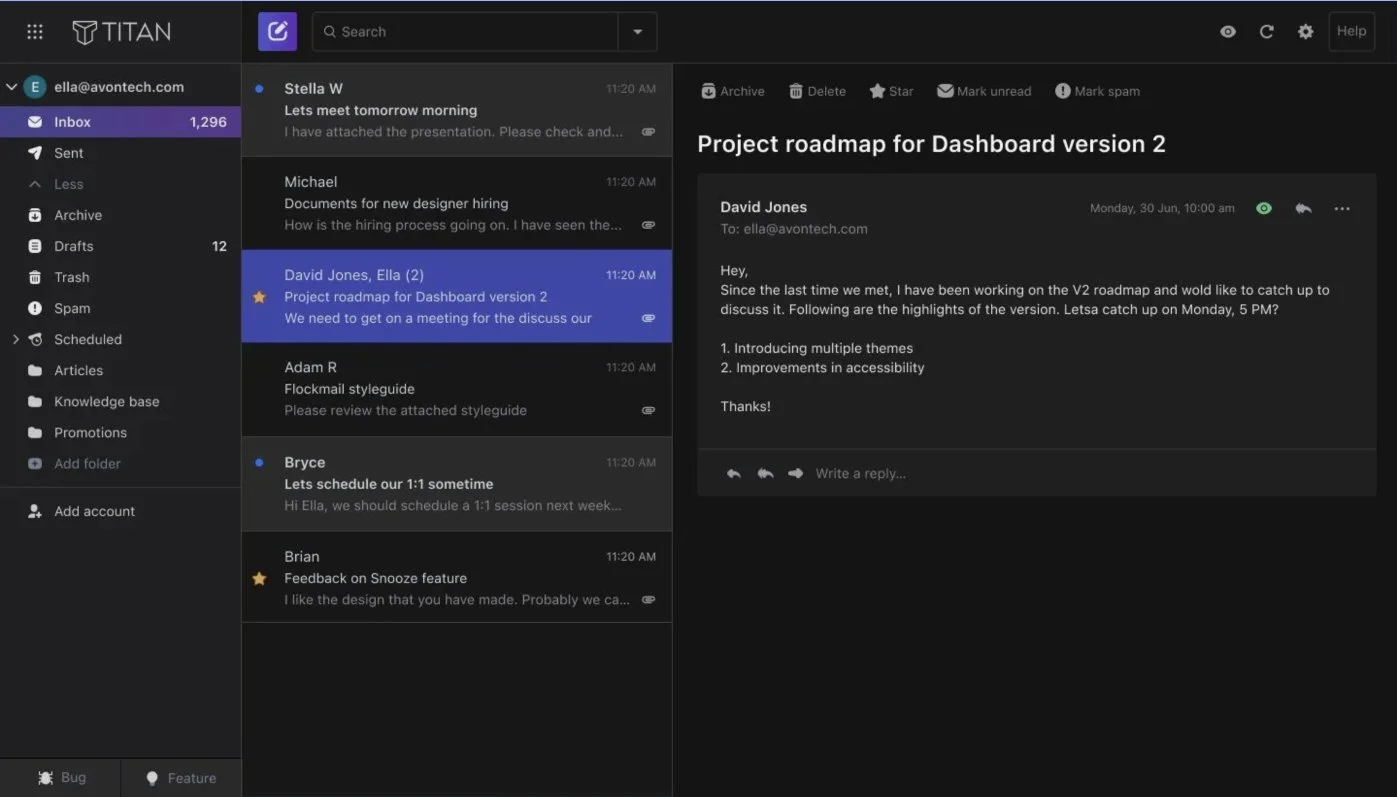
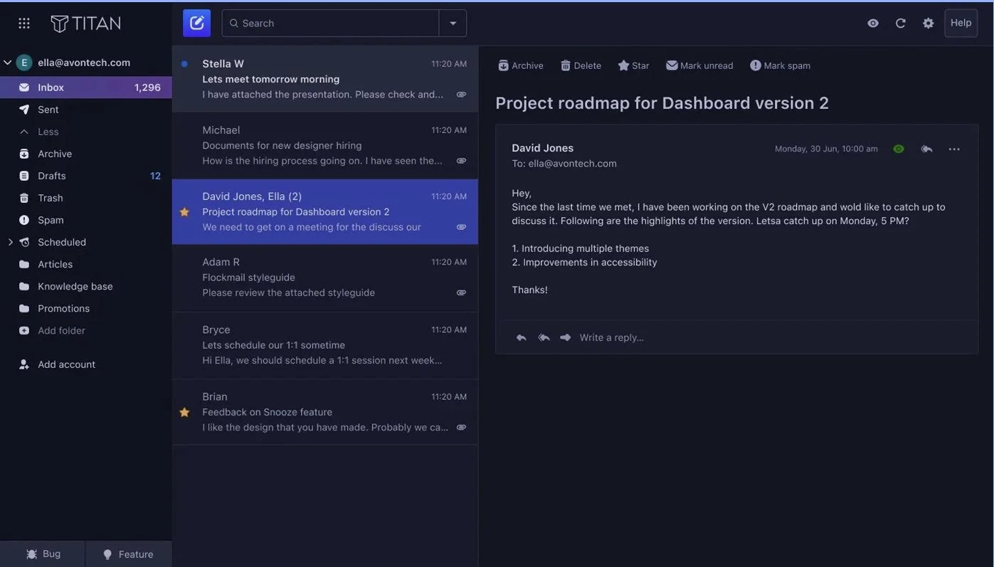
Reading Pane
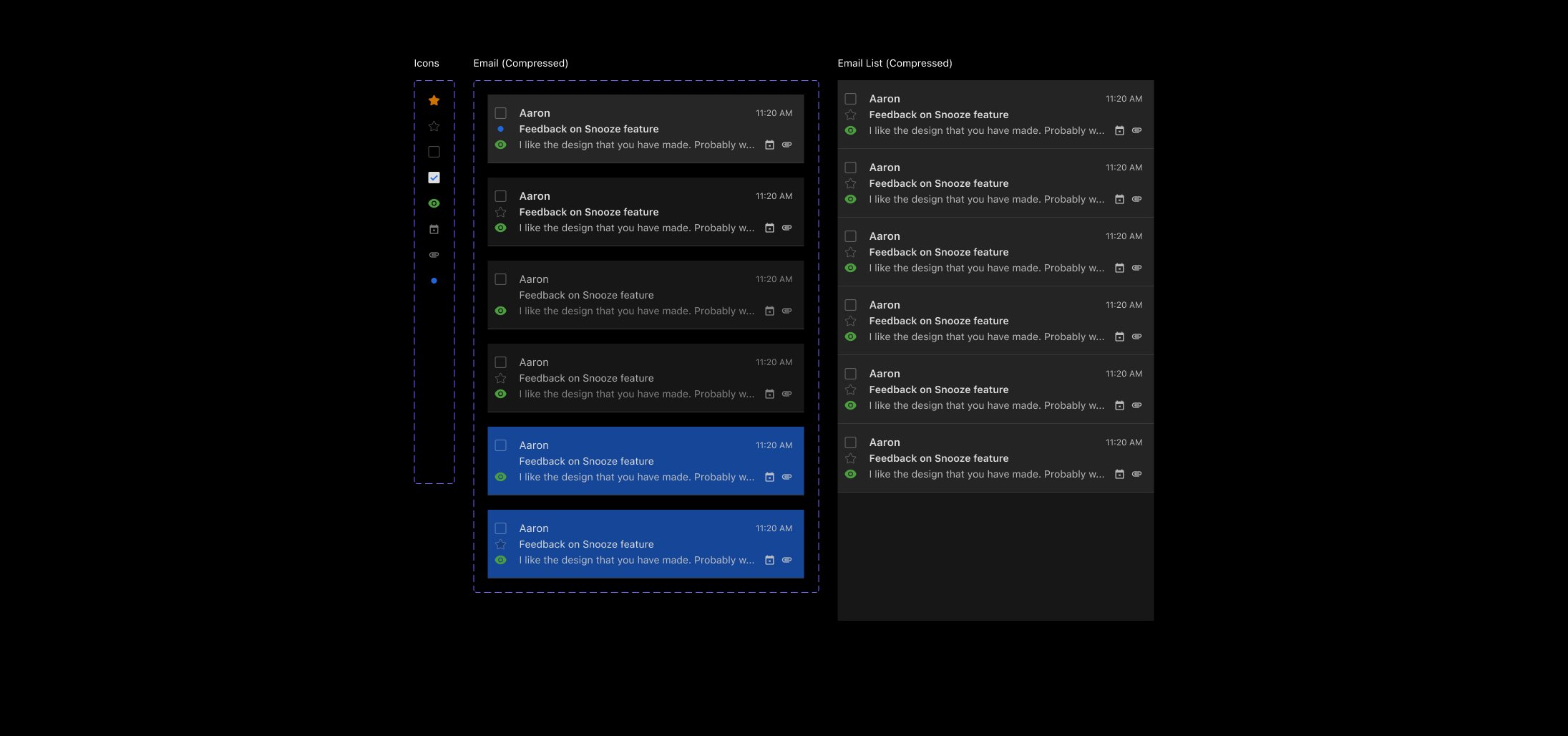
Email List
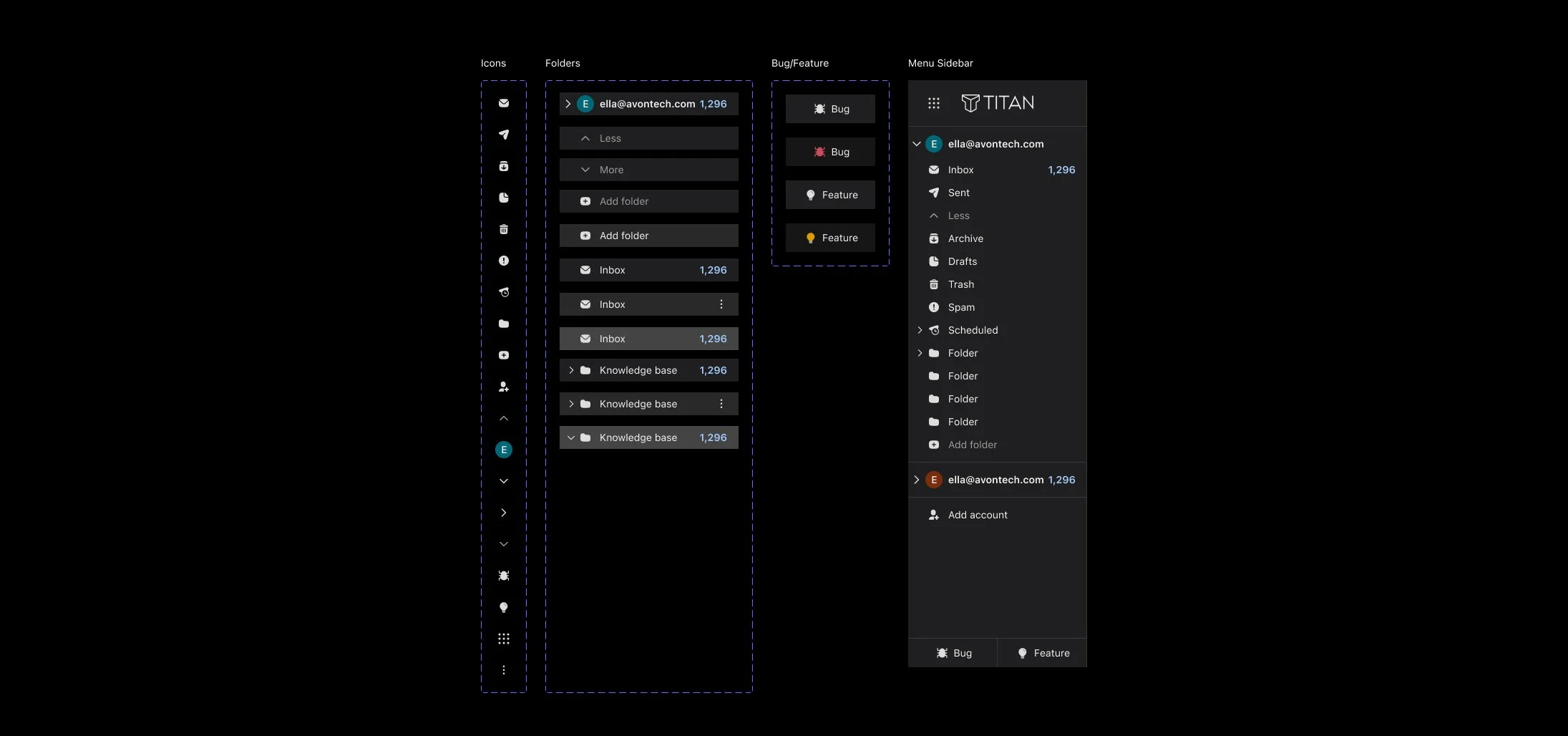
Menu Sidebar
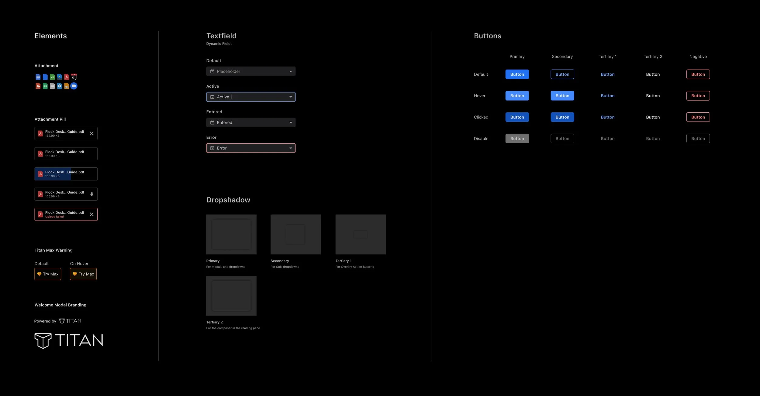
Buttons, textfields, and other elements
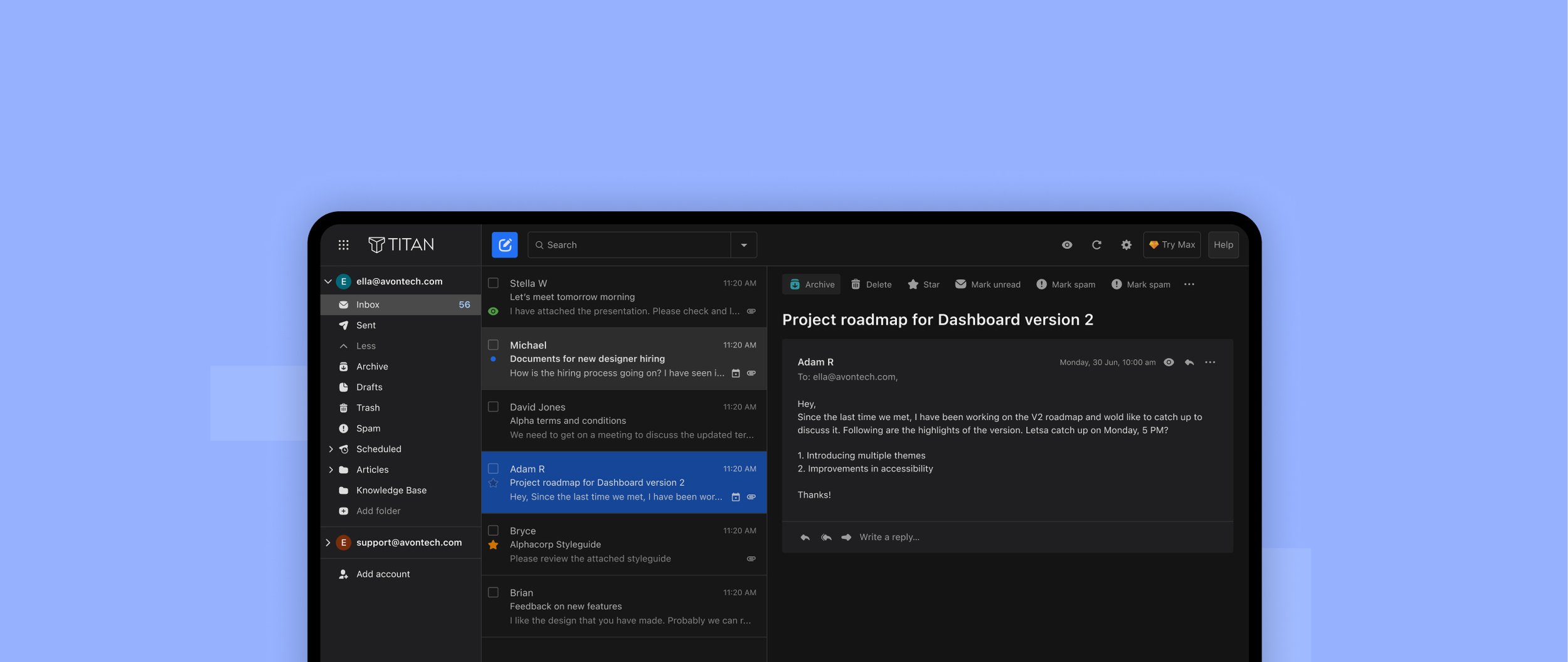
CHALLENGE
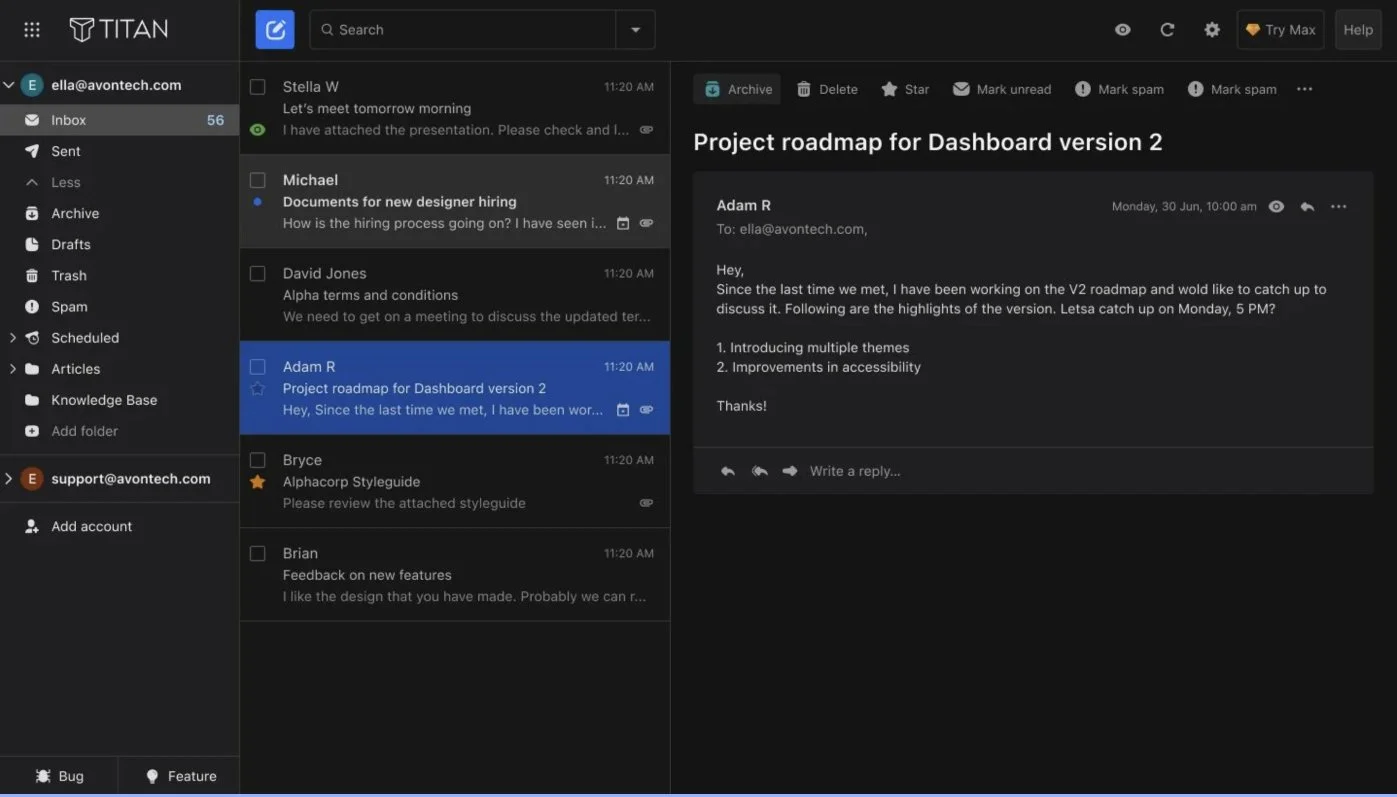
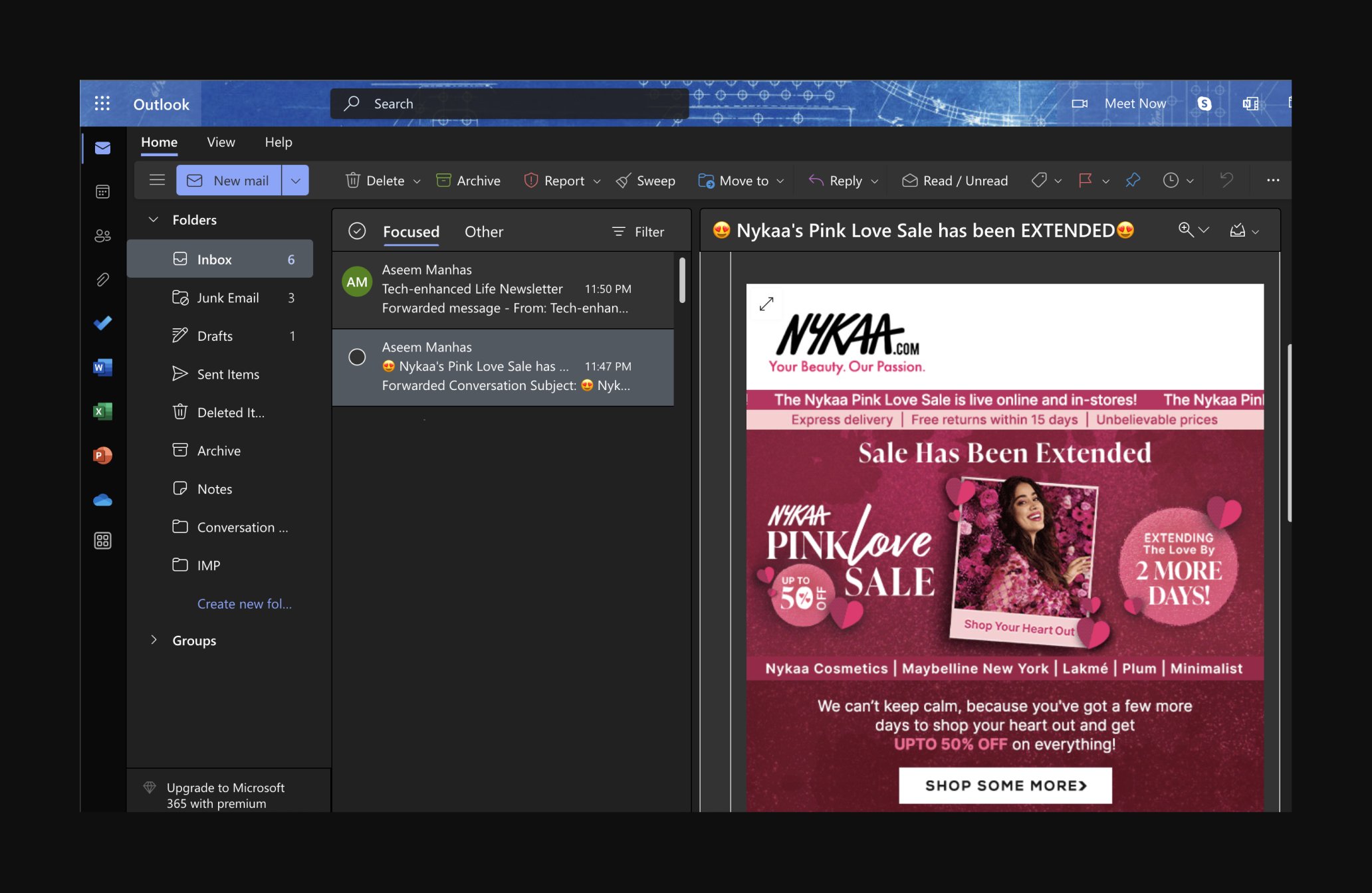
Incoming Emails
The biggest challenge, which later became our biggest strength, in the entire design process was the incoming emails. Incoming emails are sent by different senders/organisations who never compose their emails keeping the dark theme in mind.
Pure whites, pure blacks and high-intensity hues stacked against the dark theme were doing the exact opposite of what we wanted to achieve with this project. This resulted in a disruption of the visual hierarchy and an increased eye strain.
To counter this, the development team and I sat together to discuss how we wanted the colours in incoming emails to look. After digging around the Internet, they informed me ‘invert’ and ‘grayscale’ style filters could help us achieve that tonal quality. So I played around with those filters to eventually find a perfect balance of saturation and opacity that restored our visual hierarchy.
Unfiltered email colours - Outlook
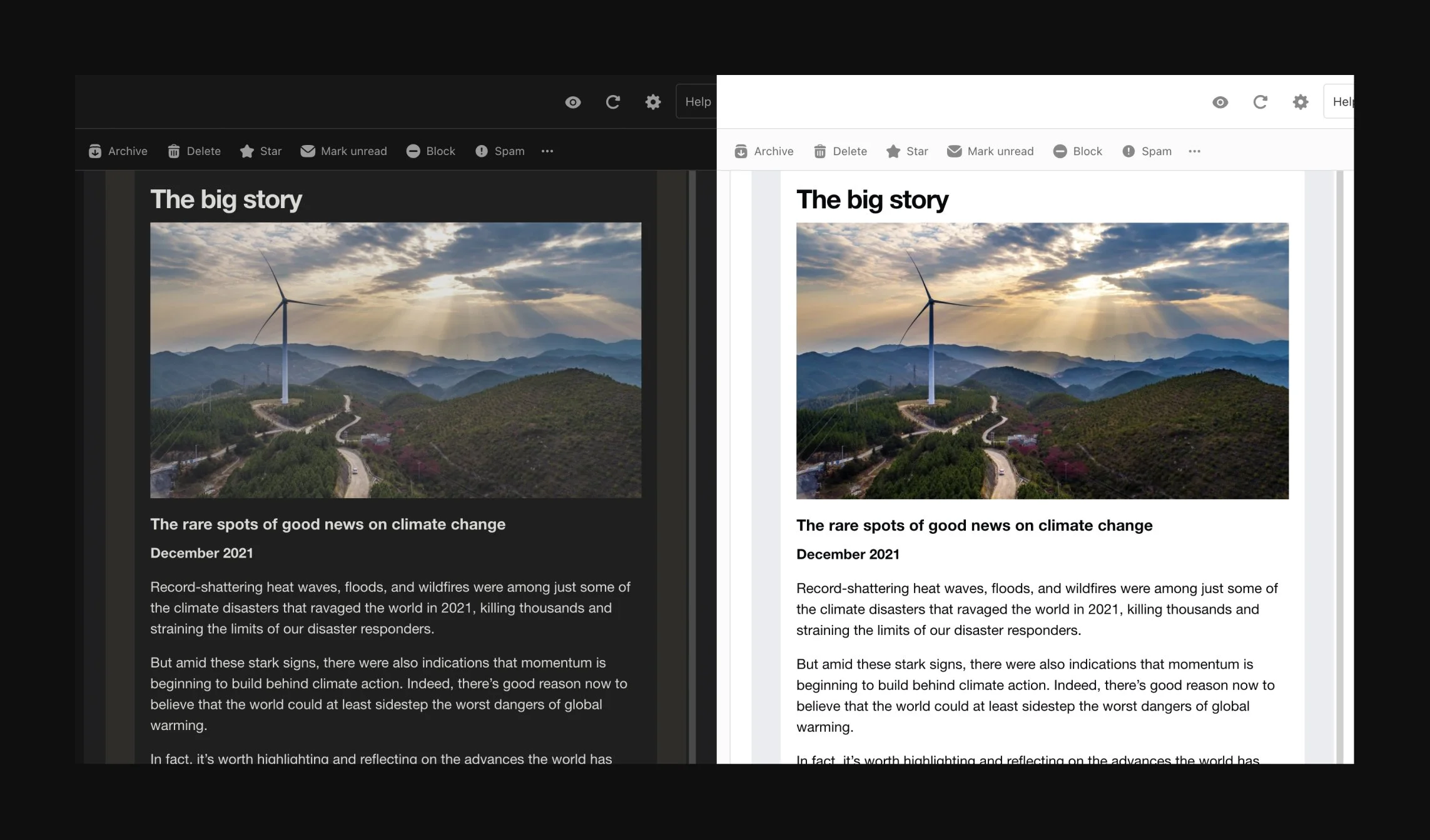
Filtered email colours - Titan
FEEDBACK
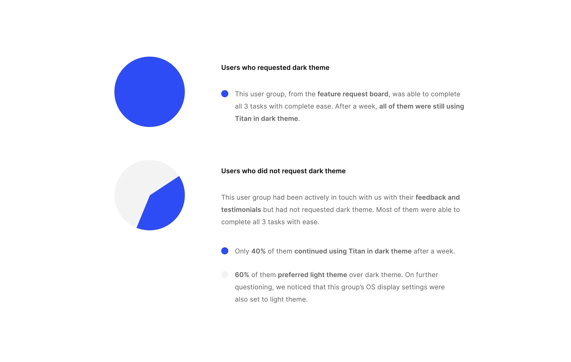
User Testing
We shared the dark theme test build with two user groups. They were given 3 tasks to perform - switch to light/dark theme, compose an email, and read an incoming email. We then asked them to go about using Titan for a week, as they normally would on a daily basis and report any difficulties or bugs they encountered.
LAUNCH
Video
LAUNCH
Coach Mark
LAUNCH
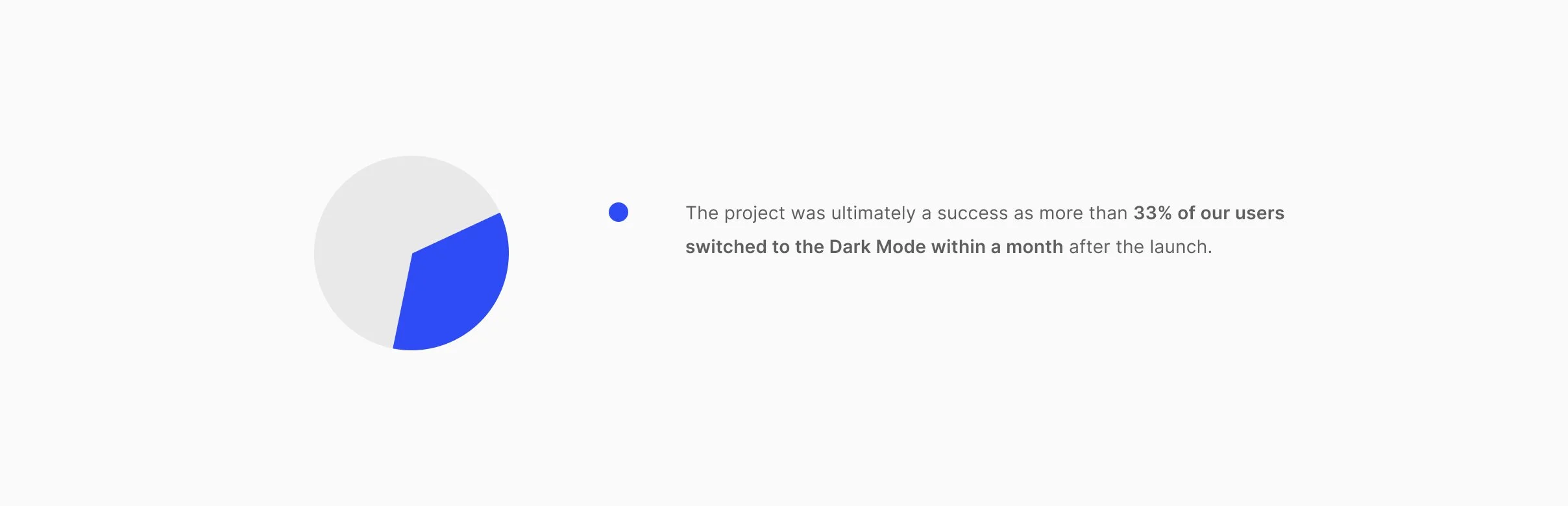
Impact