Medical Data - Scalable Design & Access
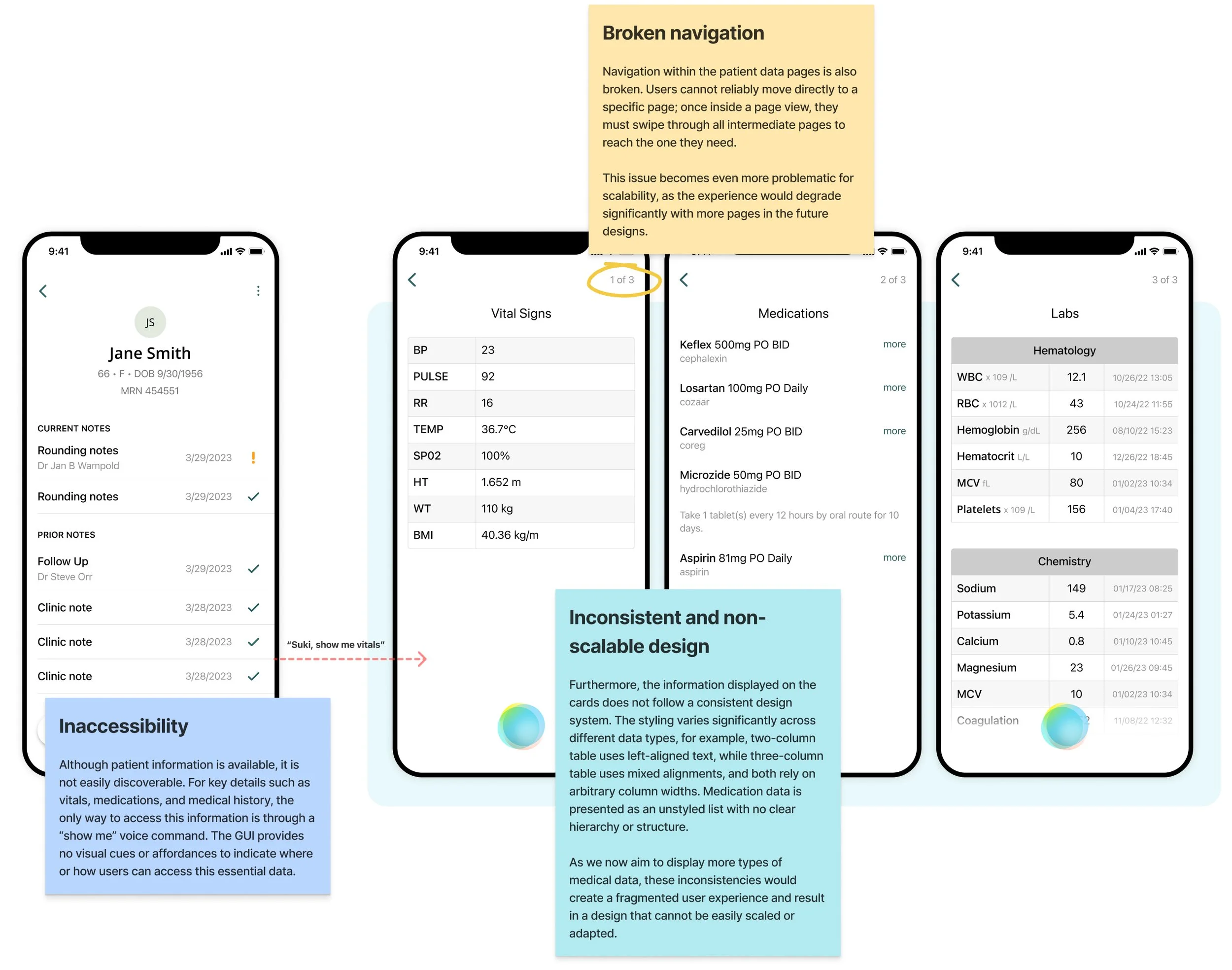
Physicians rely on patient reports to make informed clinical decisions, but Suki’s current design makes key information, such as vitals, medications, and history, difficult to discover and accessible only through voice commands. Moreover, navigation between patient data pages is broken, labels are unclear, and the interface lacks consistent styling. The design is also not scalable for adding more data types.
The goal with this project is to enable easy, intuitive access to all patient data through both voice and GUI, whether in the patient profile or while writing a note, supported by a consistent and scalable design system.
My Role
Led the end-to-end design process.
Timeline
1 month
Impact
Page visits to patient data increased by 300%, and over 90% of those visits were driven by the new GUI access points.
Background
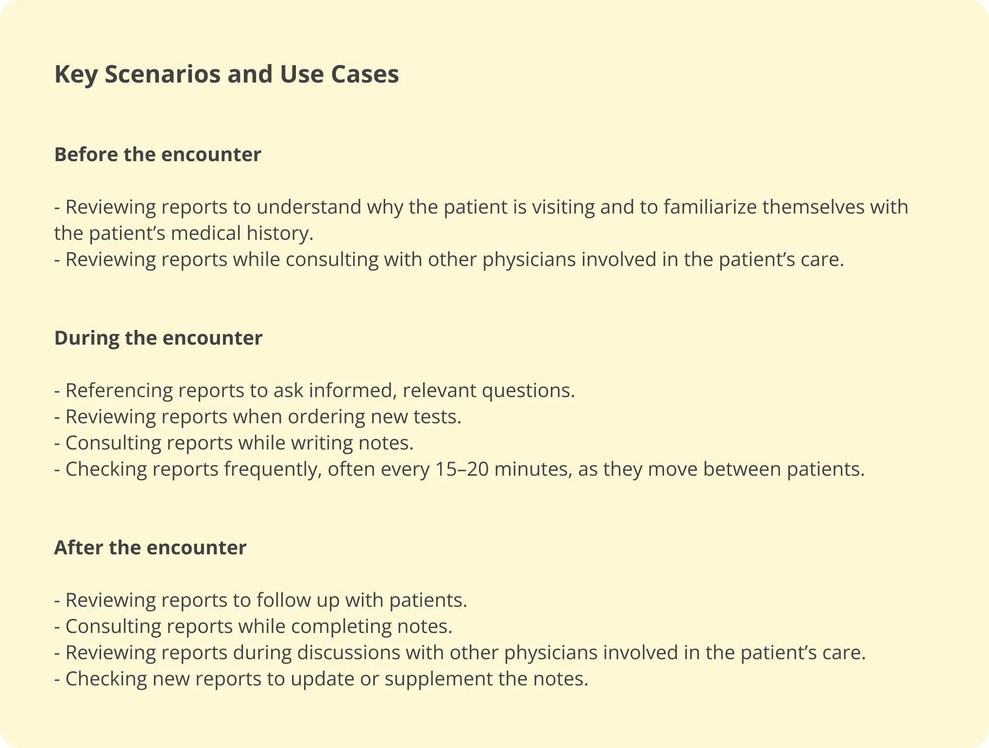
To understand the background of this project, it’s helpful to first look at an outpatient day for a physician and identify when they need to reference patient data. This workflow can be divided into three phases: the time before a patient encounter, the time during the encounter, and the time after the encounter. Across these phases, physicians spend most of their working time engaged in the following activities:
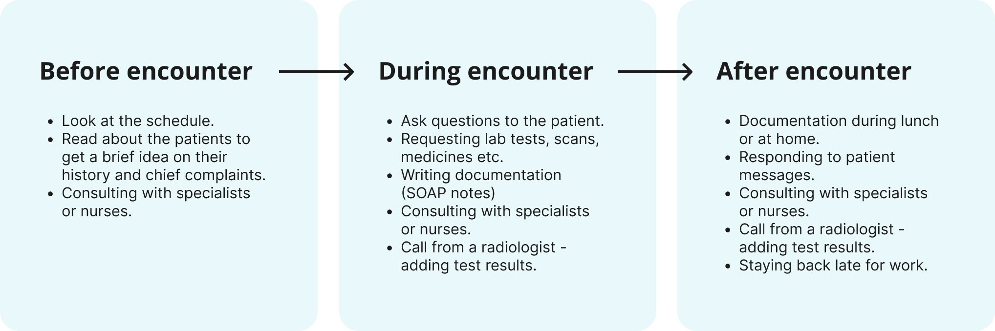
Physicians need ready access to patient information throughout each of these activities. Reviewing reports is a critical part of their workflow, providing essential details such as vital signs, problem lists, laboratory results, medications, allergies, and imaging.
Critical gaps in the current user experience
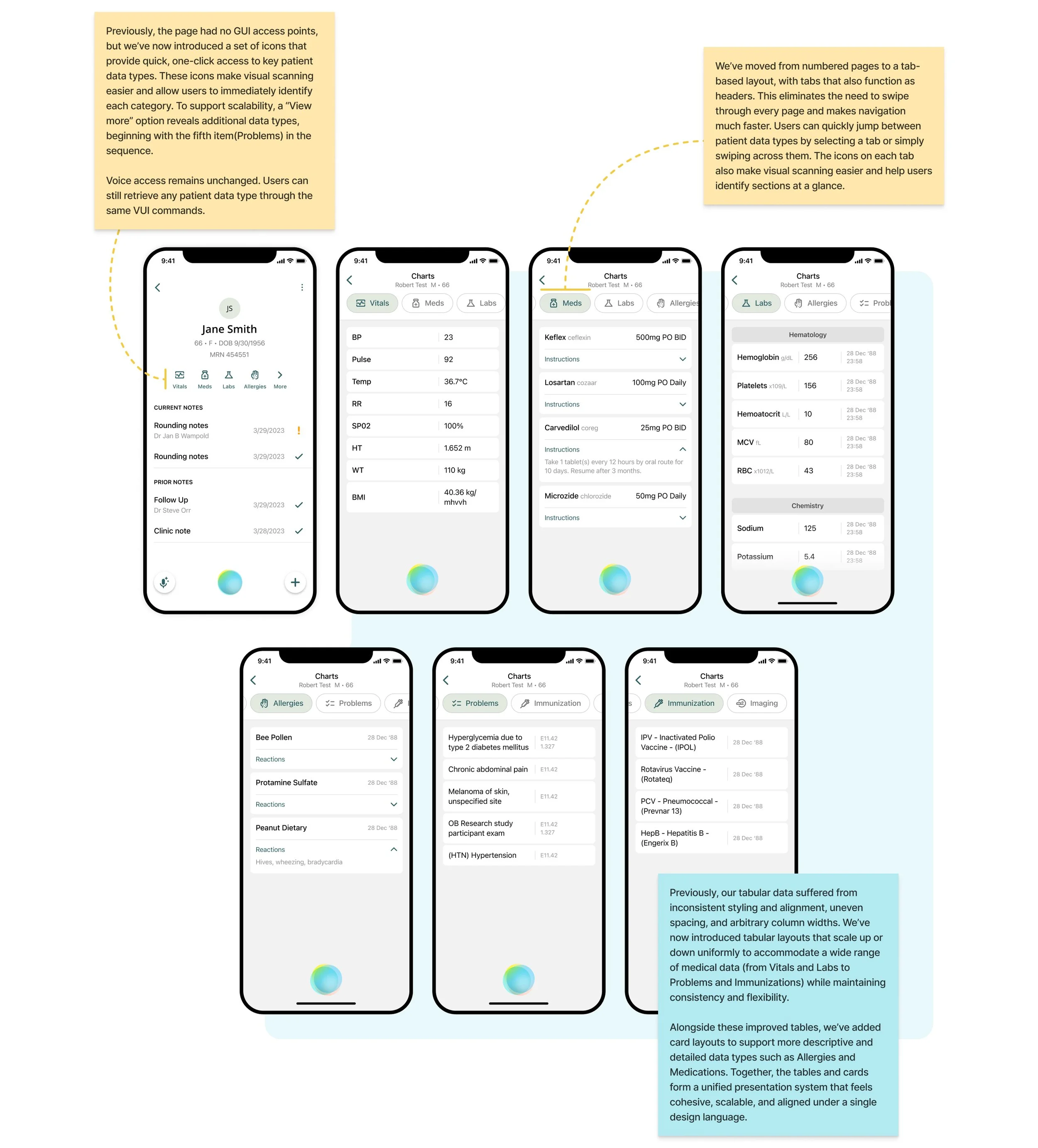
The current patient data experience is limited by three main issues: low discoverability, inefficient navigation, and an inconsistent design system. Critical information, such as vitals, medications, and medical history, is hard to find, with the interface offering no visual affordance and relying entirely on voice commands. Navigation forces users to swipe through pages sequentially, making it difficult to reach specific sections quickly. On top of that, mismatched table layouts, irregular alignments, and unstructured medication lists result in a disjointed interface that cannot support additional data types.
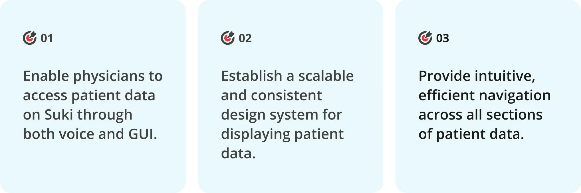
Three key targets for this project
Improving access & navigation
To determine where patient data should be most accessible, it was important to first understand when and where users require this information most frequently. To gain this insight, I examined the key scenarios and use cases in which physicians need patient data throughout their workday.
From these use cases, it’s clear that physicians need access to patient information throughout the day and always within the context of a specific patient - whether they are preparing for an encounter, writing notes, or consulting with another doctor. Because of this, placing patient data within the patient profile is the most intuitive choice, allowing physicians to find all relevant information in one centralized location.
The use cases also highlight that the only time physicians need patient data while actively performing a task in the Suki app is during note-writing. Easy access in this moment is essential, as having patient information readily available enables physicians to reference details quickly and make well-informed decisions for their care plans.
Outside of these contexts, the VUI can fetch patient data on demand anywhere on the app. But for GUI access, these two locations, the patient profile and the note screen, provide the most useful and efficient access points.
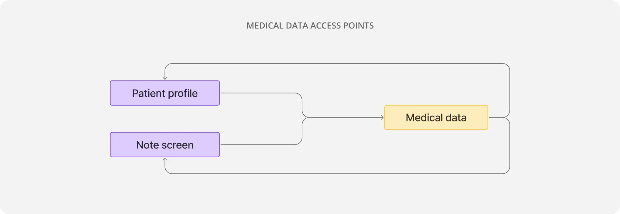
This simple user-flow map illustrates how medical data would sit at the center of the workflow, and users would have smooth and consistent GUI access to medical information from patient profile and note screen.
Shaping the access points
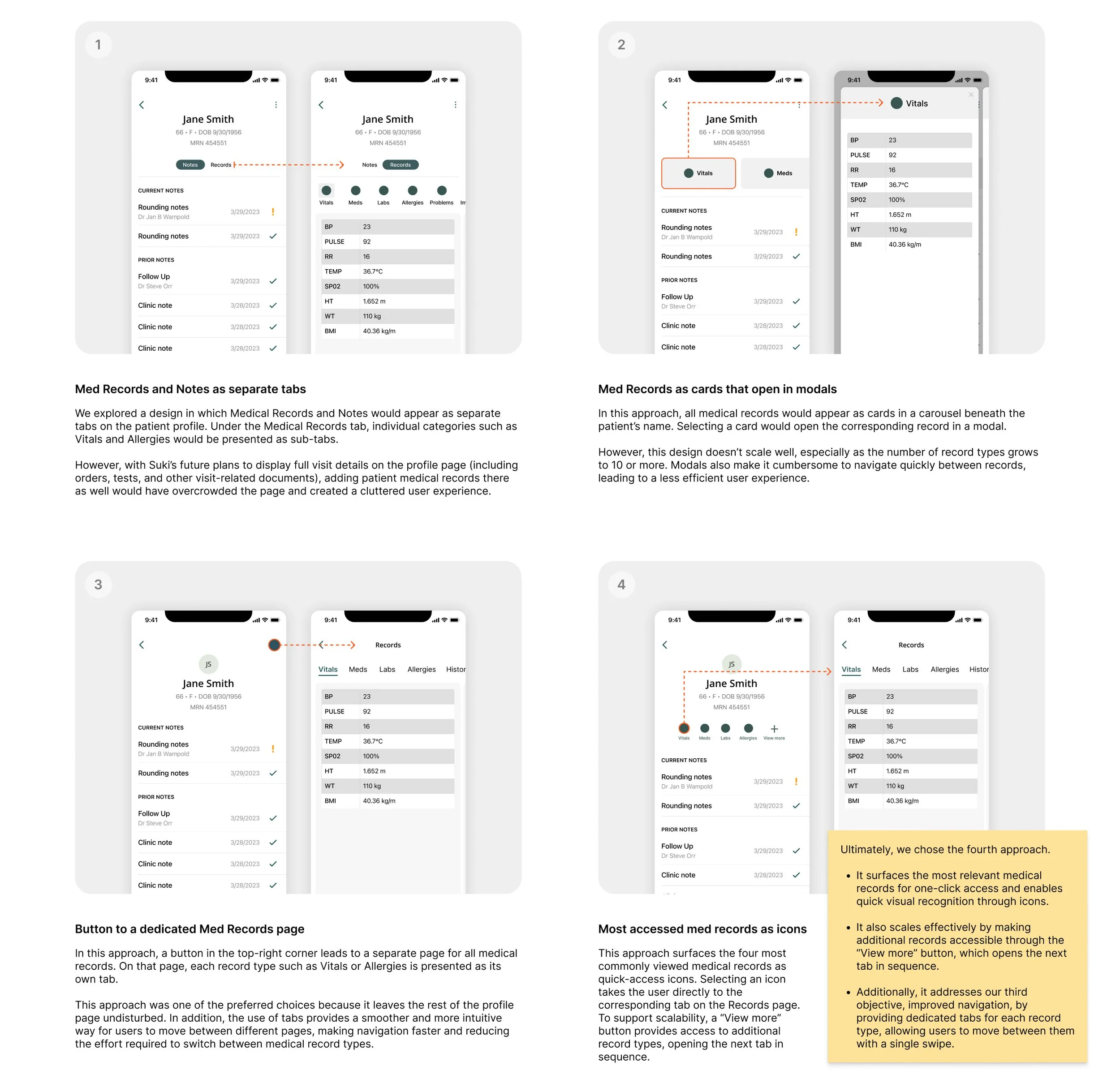
ACCESS FROM PATIENT PROFILE
I explored and evaluated a range of wireframes for incorporating access points to medical data from the patient profile.
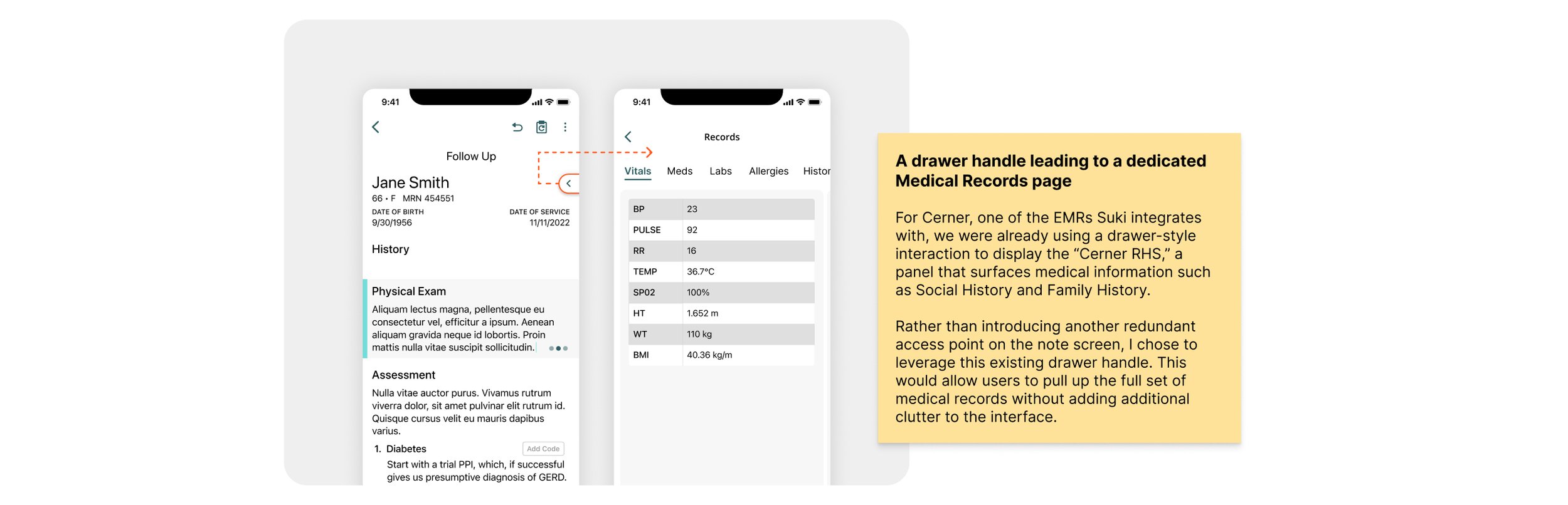
ACCESS FROM NOTE SCREEN
The access point for medical records from the note screen, where the focus is solely on the note’s content, needed to be as minimal and unobtrusive as possible.
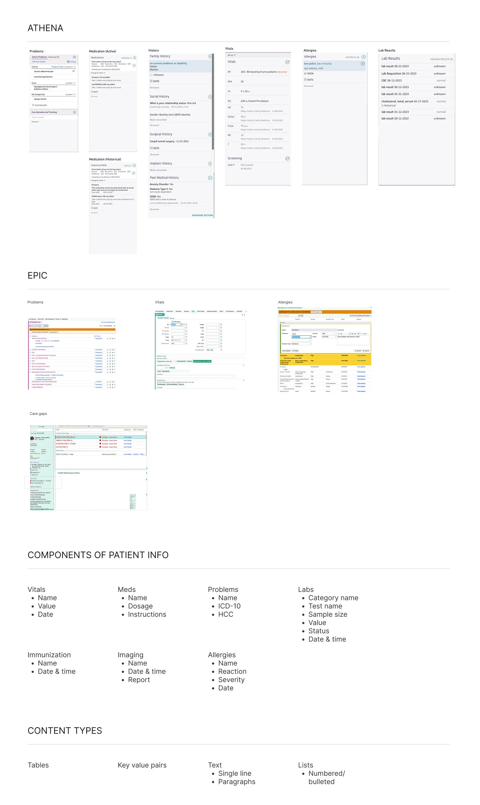
Learning from EMRs to Shape Our Design
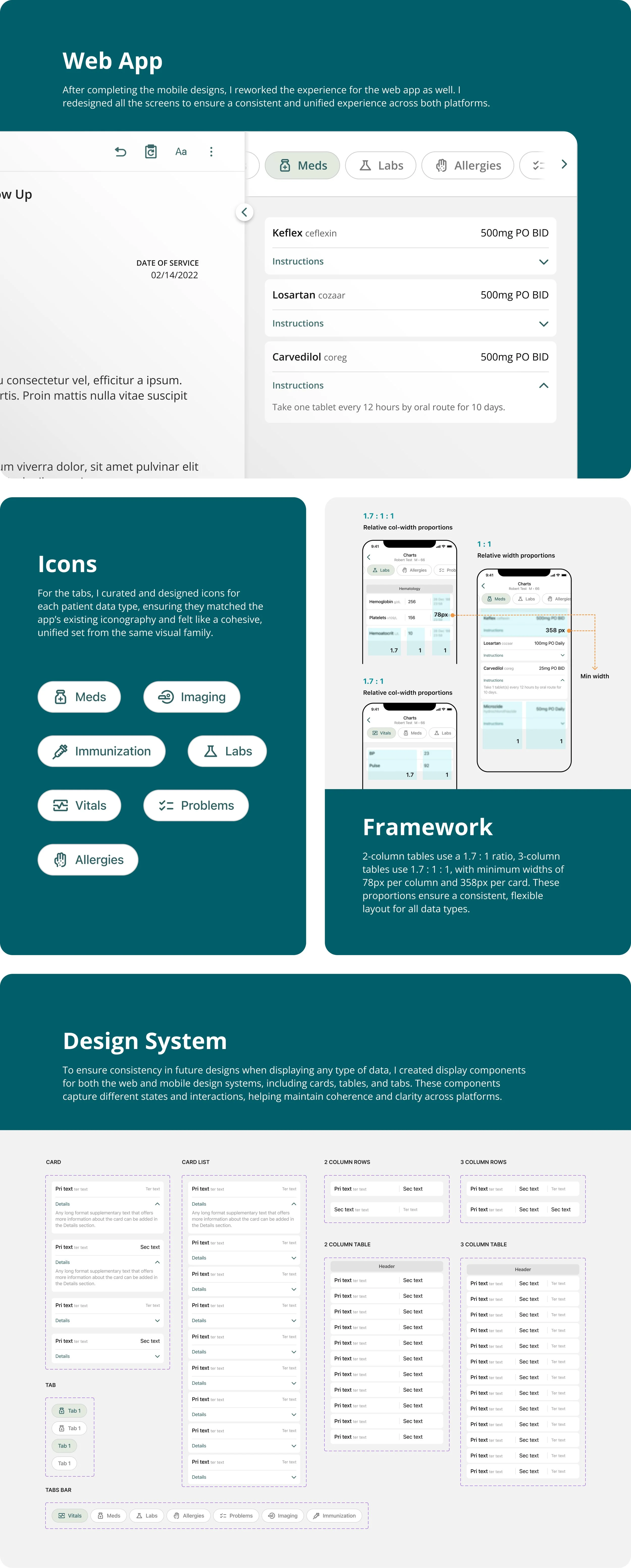
Suki previously displayed only three types of patient data in the app. As we prepared to expand to a larger set of data types, it became essential to look at all medical records holistically. I reviewed EMRs such as Athena and Epic to understand the new medical record categories that needed to be integrated and what specific information each of those categories typically includes. I also examined how these EMRs present and structure that data. These learnings provided a clarity on how the expanded dataset should be organized and displayed within Suki.
Organizing and displaying medical data
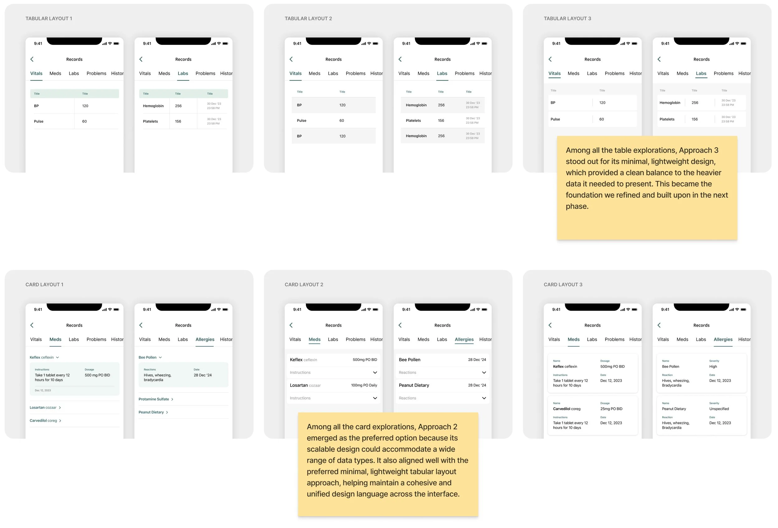
After defining the GUI access points for patient data, the next step was to address the design inconsistencies and scalability issues. With a complete list of the medical content types that needed to be displayed, I began exploring different table and card layouts to develop a cohesive design system that could accommodate every type of medical record effectively and consistently.

All-New Patient Data Experience
With a clear direction established through the above explorations across accessibility, navigation and UI, it was time to bring everything together and create the final designs. This included developing a framework and design system that addressed both scalability and consistency issues across the experience.