Vibe Coding A Multiplayer Game
What's the Word, Impostor? is a multiplayer word game where one player is secretly the impostor and receives no word. Players describe their word, vote out who they think the impostor is, and scores are tracked across rounds. Built entirely through vibe coding on Lovable with structured briefs and iterative product decisions.
The Idea
The game is simple. Everyone gets the same word except one person, the impostor, who gets nothing. Players take turns describing their word without saying it, while trying to figure out who doesn't actually know what they're talking about. At the end of each round, everyone votes. Scores are tracked. Rounds continue.
The problem I was solving was straightforward: there were hardly any dedicated tools for this wildly popular social media game. I wanted to create a system that handled word and role assignment automatically and secretly, so everyone could just play.
The Process
I wrote a PRD before touching Lovable. It covered what the product was, who it was for, the core features, what not to build, the main user flow, and success criteria. This gave Lovable enough context to generate a working first version without me having to correct fundamental misunderstandings.
From there, every subsequent version was a structured brief, a prioritised list of changes with clear descriptions of what should happen, what the user should see, and what the logic should be. No guessing. No vague prompts like "make it look better."
The game went through several versions over the course of the project.
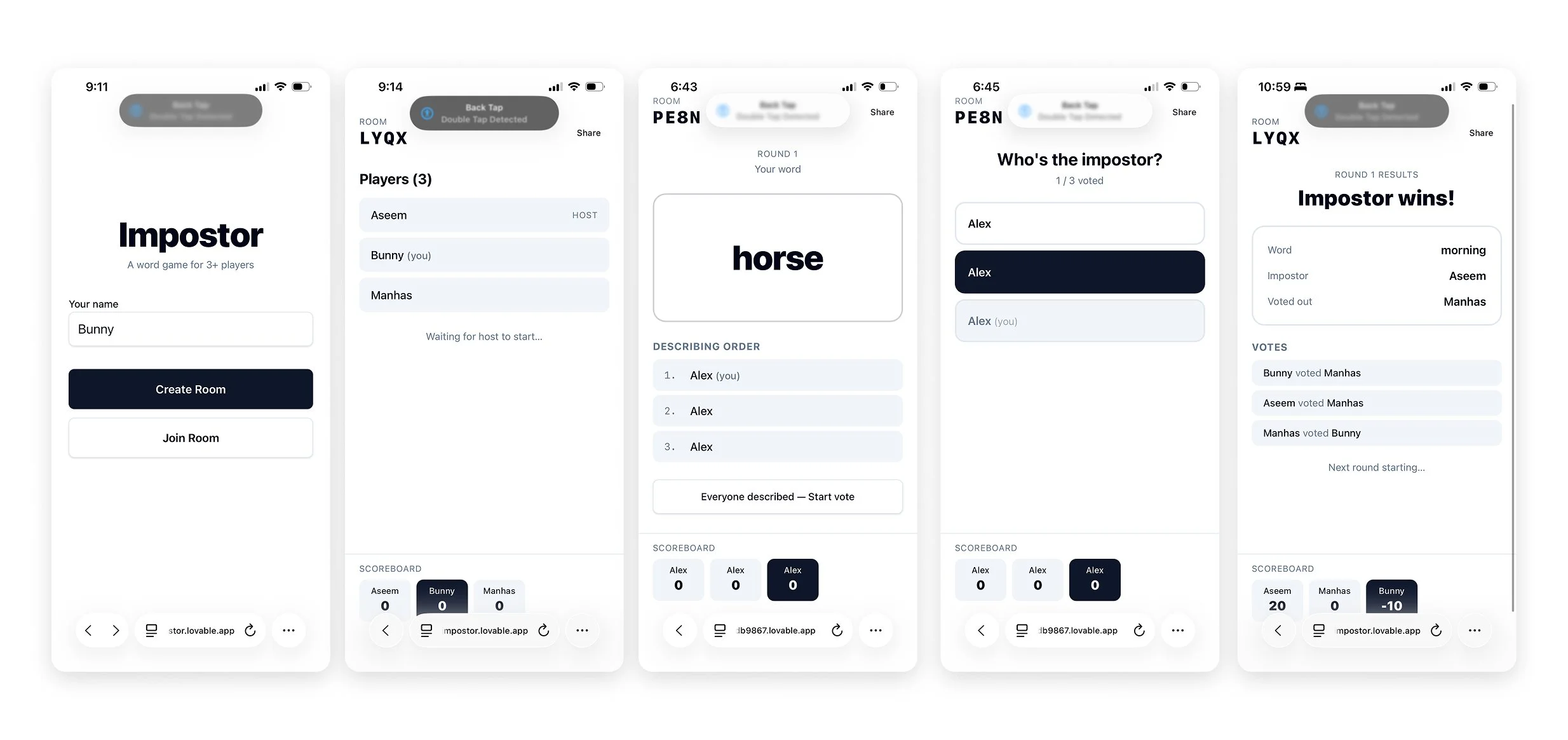
V1 - Functional but bare
The first version was black and white, minimal, and purely functional. It had the core loop working: create a room, join with a code, get a word, describe it, vote, see results, repeat. The scoreboard was pinned at the bottom. The round results appeared inline. It looked like a prototype, but the game actually worked.
What it revealed immediately: the results screen needed to be a modal, not an inline section. The scoreboard was too prominent too early. And the product had no visual identity, it was called "Impostor" with no logo and no personality.
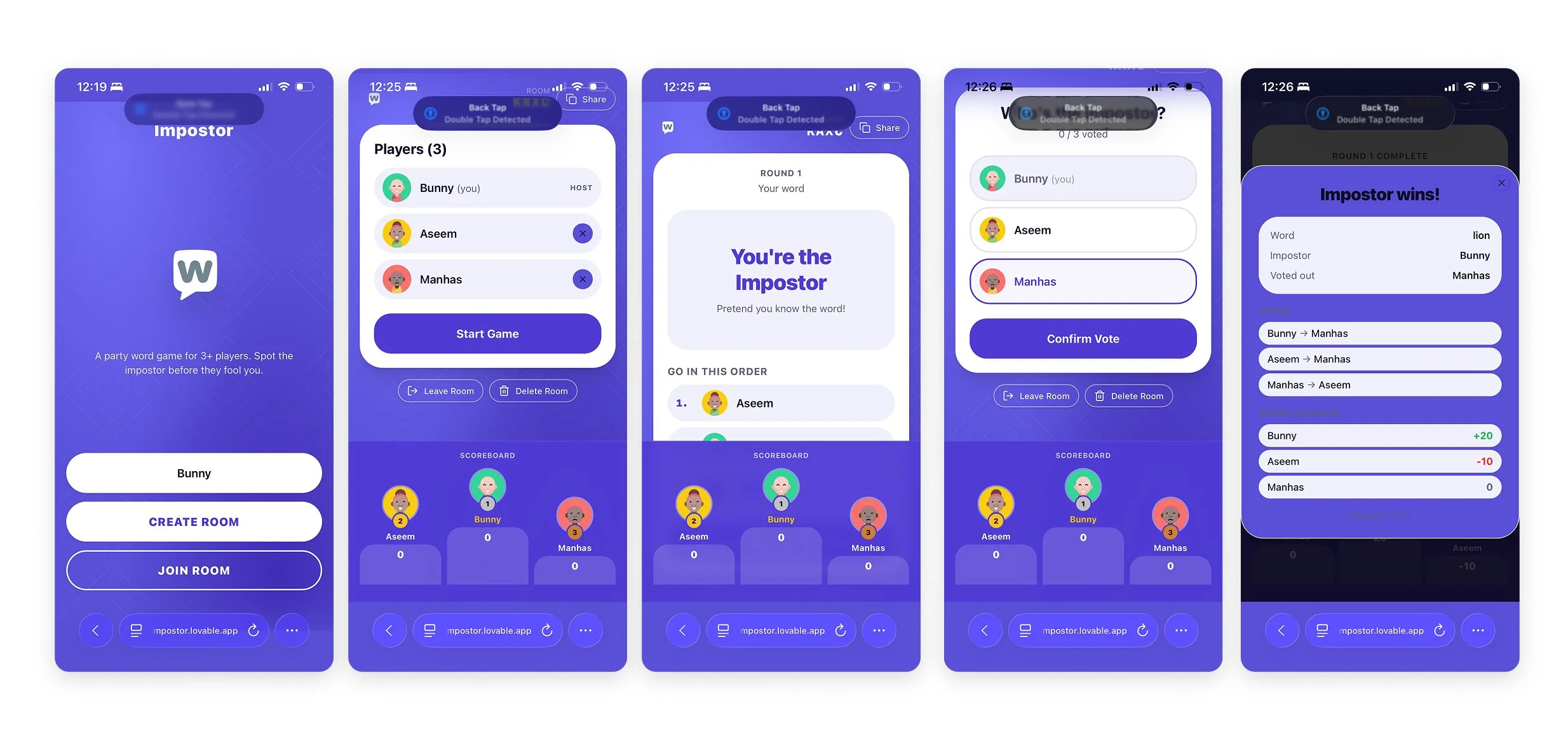
V2 - Structure and layout
V2 focused on layout and interaction fixes. Content was centre-aligned on larger screens. The room code and share button were grouped together. Host-only controls like deleting a room and removing players were added. The vote confirmation flow was introduced (selecting a player and then confirming before submitting) to prevent accidental votes. Round results moved into a timed modal that closed automatically after 10 seconds.
The scoreboard logic was also corrected here. The first version had negative scores for players who voted incorrectly, which felt punishing for a casual game. This was refined across subsequent versions.
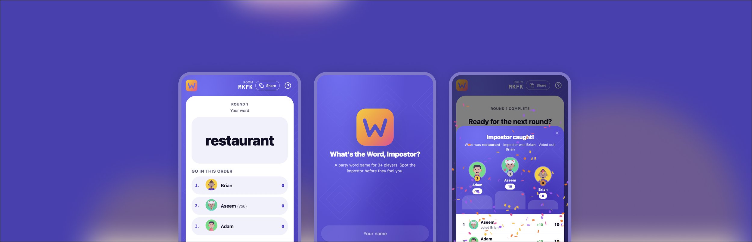
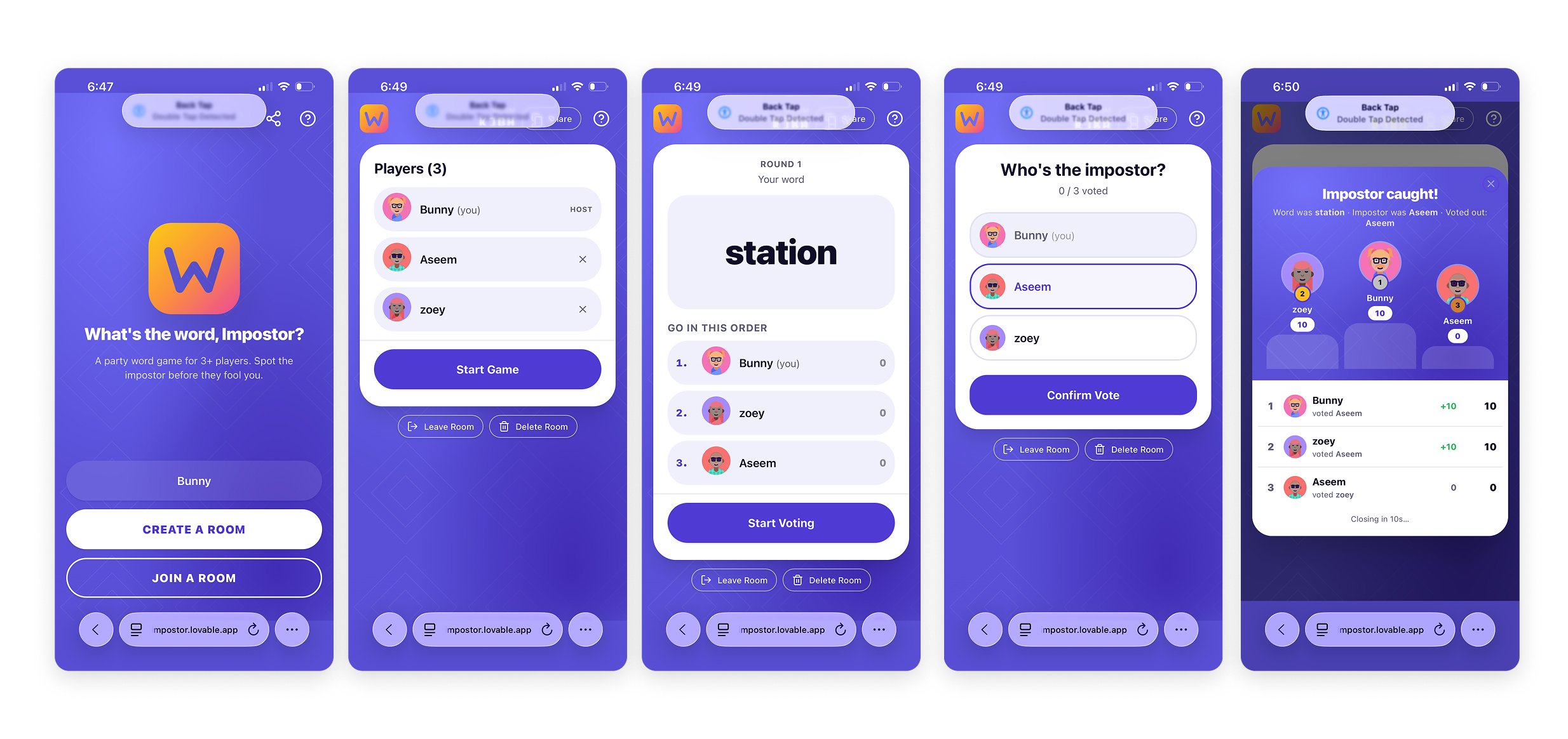
V3 - Visual identity
V3 was the biggest visual shift. The app moved from a white interface to a deep purple background with white card surfaces, rounded corners, and bold typography. A style referenced from existing quiz game apps. Avatars were introduced for each player, automatically assigned and shown in circular frames with coloured backgrounds. The scoreboard modal was redesigned with a podium view for the top 3 players and a detailed results list below.
The logo also came together here with a gradient W in yellow, orange, and pink on a rounded square, consistent with the product name.
Key Product Decisions
Score logic The original brief had negative scores for players who voted incorrectly when a regular player was eliminated. This was removed across iterations. The final logic: if the impostor is caught, all other players get +10. If a regular player is voted out, the impostor gets +20 and everyone else gets 0. No negative scores; the game is meant to be social and fun, not punishing.
Medals and scoreboard visibility In the Go in This Order list, medals were never shown as that section is about the current round, not cumulative standing. Medals on avatars were held back until after the first round so the scoreboard didn't feel loaded before anyone had played.
Start Voting button Only the host sees it. This prevents any player from accidentally triggering the vote phase before everyone has finished describing their word.
Confetti logic Confetti only plays when the impostor is caught, for the players who weren't the impostor. When a regular player is voted out, confetti plays only for the impostor. The animation reflects the actual outcome rather than firing indiscriminately.
What I Learned
The quality of the output is directly tied to the quality of the brief. Every version that came out well was one where I had thought through the interaction, the edge cases, and the exact behaviour before writing the prompt. Every version that needed rework was one where I left something ambiguous.
As a designer, the process felt familiar. Writing a brief for Lovable is not unlike writing a UX doc for designers and engineers. You need to know what you want, why you want it, and what success looks like. The difference is the iteration speed. What would have taken weeks of engineering time took hours.
The project also reinforced something I already believed that product decisions matter more than visual polish at the early stage. V1 looked rough but the game loop worked. That foundation made every subsequent visual improvement meaningful rather than decorative.